Strategic Design 2
For this project, I developed Kemuri, an exclusive craft beer brand in Tokyo, Japan, targeting high-income earners. The brand focuses on premium, locally sourced ingredients and sleek, handcrafted packaging. My process began with brainstorming and sketching logo concepts based on Japanese symbolism, but after tutor feedback, I refined the design to better reflect the meaning of Kemuri (smoke).

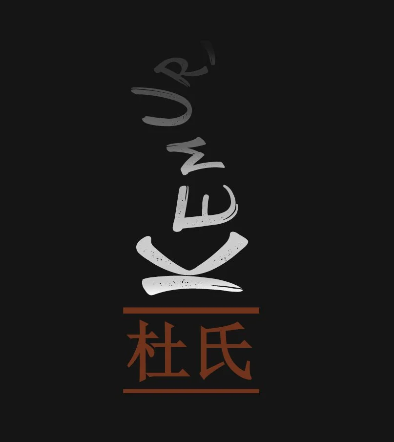
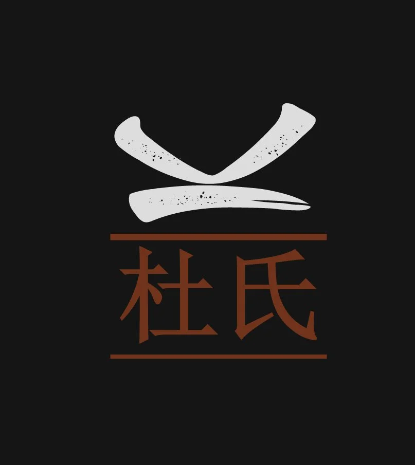
New Logo
The new logo is simple and clean yet still convey the feeling of Kemuri brewery.
Old Logo

New Name Logo
The name logo has three iterations: plain, smoke, and glow.